
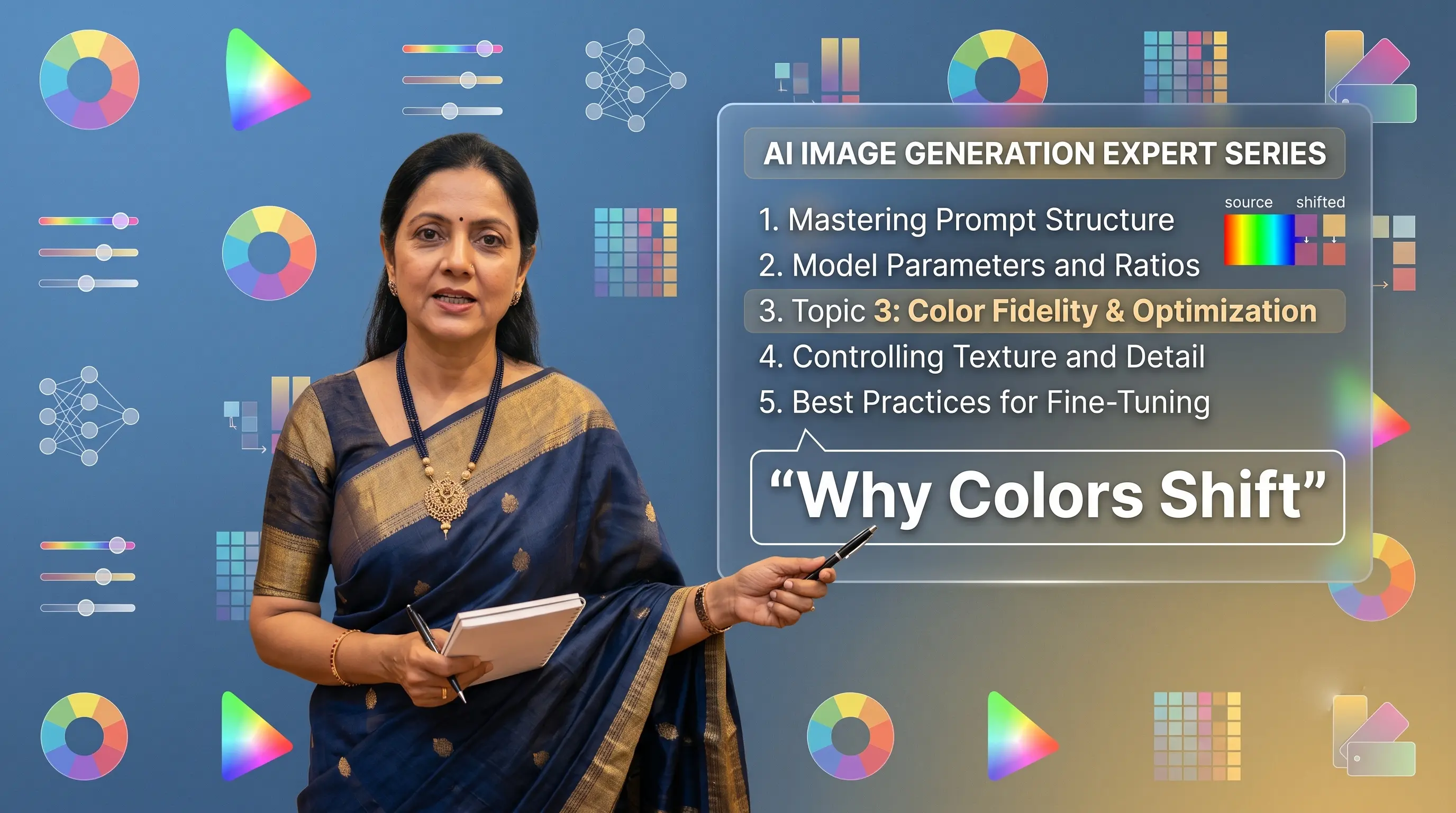
The AI-generated image looks beautiful. The model is elegant. The background is tasteful. There is only one small problem: your deep wine-coloured saree has become red, and your bottle-green kurta is now emerald.
AI can usually understand colour well, but it can only work with the colour information visible in your input image. If your source photograph has yellow indoor lighting, harsh sunlight, strong shadows, or camera filters, the AI may interpret the wrong colour as correct.
- Photograph garments in soft daylight.
- Check that the photograph matches the actual product.
- Avoid beauty filters and automatic colour effects.
- Use a neutral background.
- Do not unnecessarily describe garment colours in the prompt.
- Compare the final output with the physical garment, not only another screen.
"AI does not know what colour your garment is supposed to be. It knows what colour your photograph appears to be."
What the Problem Looks Like
1. The generated colour is slightly off
The most common issue is a nearby color shift: maroon becomes red, mustard becomes yellow, bottle green becomes emerald, or navy becomes royal blue. Fashion customers shop based on specific shades, so slight shifts change the product perception.
2. The background looks excellent, but the garment colour shifts
Suppose the original garment is cool-toned blue, but the background contains warm sunlight and beige walls. The AI may introduce warm reflections into the garment so the model feels naturally placed, causing the product to look greener or greyer than it really is.
3. Different areas of the same garment show different colours
Upper sections may appear darker than lower sections, or the saree body and pallu no longer match. AI struggles to decide whether a darker area represents a shadow, printed section, or actual fabric shade.
4. Bright colours become oversaturated
AI models often favor eye-catching results, making reds richer, golds yellower, and pinks brighter than the physical fabric.
5. Dark colours lose their detail
Black, navy, and deep green garments can be difficult to photograph. To recover visible fold details, AI may brighten the garment, making black appear charcoal or navy appear royal blue.
Why It Happens
1. Store lighting and yellow casts
Warm yellow retail lights can make white appear cream, blue appear greener, and silver appear gold. Mixed light sources (LEDs + daylight) confuse camera white balance.
2. Automatic camera processing
Phone cameras automatically adjust saturation, contrast, and skin tones to look attractive rather than color-accurate.
3. Prompt descriptions conflict with the reference image
If the uploaded garment is navy blue, but the prompt says "bright royal blue dress", the text instruction conflicts with the visual reference and forces a color shift.
4. Environmental reflections
Strong background colors (green foliage, red walls) reflect light onto fabric edges during scene integration.
How to Improve the Result (Practical Action Guide)
Place the physical garment next to your phone photo under neutral light to verify the main color matches before uploading.
Capture photos near a large window or in open shaded areas. Avoid harsh direct sun or yellow ceiling lights.
Use white, light grey, or neutral beige backdrops to prevent color bounce onto fabric edges.
Use standard natural camera modes without portrait saturation or warm skin filters.
Instead of writing "bright royal blue dress", instruct "Preserve the exact garment base color from reference image".
Always inspect final selects against the real fabric under consistent lighting before publishing.
How Drape Studio Handles It
At Drape Studio, colour accuracy begins before the final image is generated:
We inspect source garment uploads to detect white balance shifts or overexposure.
Base fabric tones and highlight detail are calibrated to prevent oversaturation.
The image is rendered with strict prompt constraints prioritizing visual reference colors over text descriptions.
Multiple generated poses are evaluated to guarantee color consistency across folds and lighting.
Environmental color casts are balanced so the product remains authentic and sale-ready.
"Make sure your source image matches the real garment before asking AI to match the source image."